
Why this screen
“Overview” opens first every time you launch the app. It's a morning look at your money: is everything all right, what's running low, what's ahead. You don't divide up money or edit transactions here — that's what “Budget” and “Activity” are for. Here you look and decide where to go next.
Is everything all right
Is there unassigned money, where's a minus, which envelopes are emptying faster than the month is going.
What already happened
Recent transactions, big expenses, a calendar of spending days.
What's ahead
Scheduled payments, goals that are short of money, and this month's spending against the usual.
Minimize the app for more than half a minute, and when you come back it opens “Overview” again. If you'd rather return to where you left off, choose that in “Settings → Appearance → Return to”.
What's where on the screen
Tap any screenshot to open it full screen.
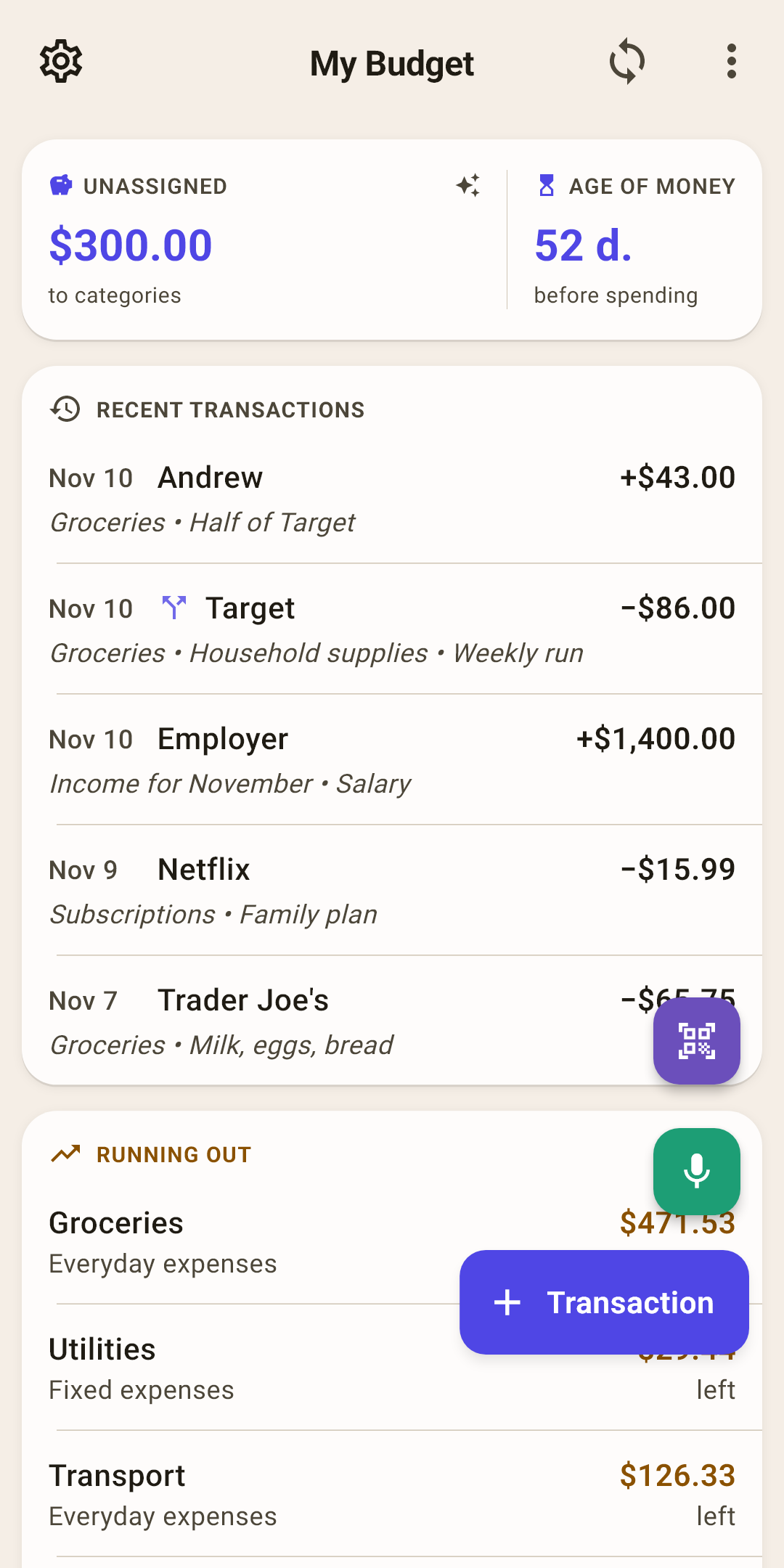
Settings — the gear. All of the app's settings: sync, backups, appearance, language.
Budget name — tap it to open the list of your budgets and switch to another one.
How it works
You can have several budgets: for example, personal and family, or an old one you don't want to delete. To create, rename or delete a budget — the “⋮” menu → “Budgets” (below).
Sync — two arrows in a circle. Tap it — your edits go to the cloud, and edits from other devices come here.
How it works
The number on the icon is how many edits haven't been sent yet. Right after a sync the icon flashes for 15 seconds: green — it worked, red — it didn't. Hold your finger on it, and the app tells you what happened.
A single failure is usually the network: the subway, a cabin in the woods. If it fails four times in a row, the icon stays red with a “!” inside until it goes through. No cloud connected — the icon is its usual color, with no number.
The “⋮” menu — budgets, choosing blocks, “Hide amounts”. Explained below.
“Unassigned” — money that's in your accounts but not yet divided among envelopes. Tap it, and the app suggests how to hand it out.
How it works
The label changes along with the number:
“Unassigned” — there's money to hand out. In the screenshot it's $300: a paycheck arrived, and the envelopes for November are already filled.
“All assigned”, in green — every dollar has a job. That's the goal.
“Over-assigned”, in red — more was put into envelopes than there is in the accounts. Take the extra out of some category on the “Budget” screen.
You can tap it only when there's something to hand out. The “Auto-assign the budget” sheet opens: “Cover all overspending”, “Underfunded”, “Assigned last month” and other ways. Next to each is how much it would take. Nothing changes until you confirm. More about envelopes — in the article “Budget”.
“Age of money” — how many days on average your money sits before you spend it.
How it works
In the screenshot it's 52 days: what you spend today came to you almost two months ago. The app takes the last ten expenses and looks at which income paid for each — the oldest money gets spent first.
Under 30 days — you live paycheck to paycheck, and any delay in pay hits the budget. Over 30 — you're spending last month's money, and the new paycheck calmly waits its turn. A minus — more was spent than there was money in the budget accounts. The hourglass on the icon says the same: full — 30 days or more, half empty — less, empty — a minus.
Age can be calculated three ways, and from 30 days it makes sense to live on last month's money. All of that — below.
Blocks — summary cards, one under another. Which to show and in what order is up to you. Each block is explained below.
“+ Transaction” — record spending or income. Above it — the camera (a receipt by QR code) and the microphone (by voice). Scroll down, and the buttons fold into a single “+”.
How it works
It's the same form as on the “Activity” screen: every tab has a way into it.
The blocks in order
Under the “Unassigned” chip (callouts 5 and 6) come the cards. Here they're in the order they have right after installing. A block with nothing to show hides itself: no tags — no “My tags”, no goals — no “Goals”.
To remove a block, bring it back or move it higher — “⋮” → “Widgets” (below).
 Open the screenshot full size ↗
Recent transactions
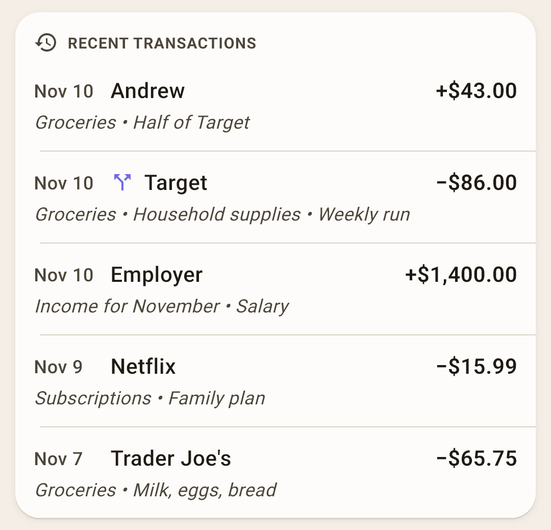
The last five entries: date, payee, amount, category and note. Handy for checking that everything from yesterday is recorded.
How it works
Income has a “+” sign, spending a “−”. A split amount (“Target” in the screenshot) has a fork icon next to it, and its categories are listed separated by dots. There are two incoming amounts in the screenshot: a paycheck and $43 from Andrew — a friend paid back his half of “Target”. That's not income but a refund to “Groceries” (how to record it — in the article “Transaction form”).
The rows here aren't tappable. To fix a transaction, open “Activity”.
 Open the screenshot full size ↗
Overspending and “Running out”
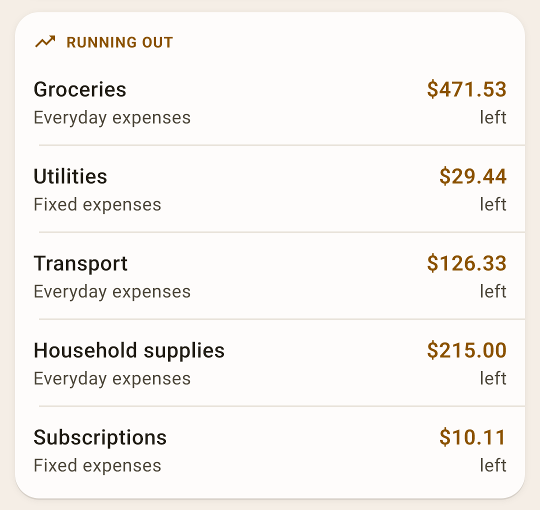
Envelopes that need attention right now. Tap a row to open that category's screen.
How it works
“Overspent”, in red — the category is in the minus: you spent more than you set aside. A wallet icon means a minus from your own money; it will take from next month's “unassigned”. A card icon and yellow mean a minus on a credit card: it grew into card debt rather than eating your money. To clear a minus — on the “Budget” screen.
“Running out”, in yellow — the envelope still has enough money, but you're spending faster than the month is going. The app divides the month's plan evenly by days and allows a 15% margin. In the screenshot, today is November 10, and more has been spent on “Groceries” than due by this date, even with the margin.
“All under control” — no minuses, no warnings. The block shows this instead of being empty.
Categories with exactly zero left don't appear here: the plan was met to the cent.
 Open the screenshot full size ↗
Where the money went
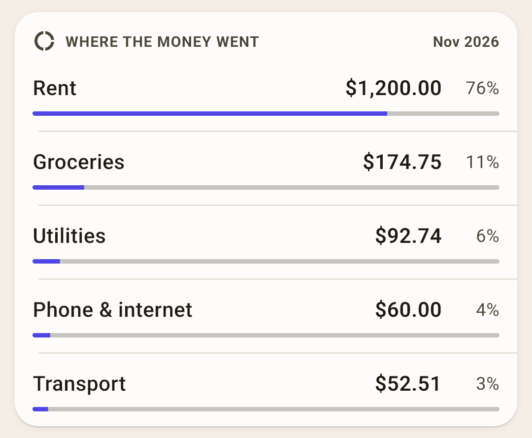
The month's five most expensive categories: amount, percent of all spending, and a bar of the same length.
How it works
In the screenshot, “Rent” is 76% of November spending: rent is paid on the 1st, all at once, while other spending builds up day by day. By the end of the month the percentages even out.
Swipe the card right with your finger to see last month, left for the next one. To get back to the current month — the “Today” chip, which appears in the card's header when you've moved to another month.
 Open the screenshot full size ↗
What's ahead
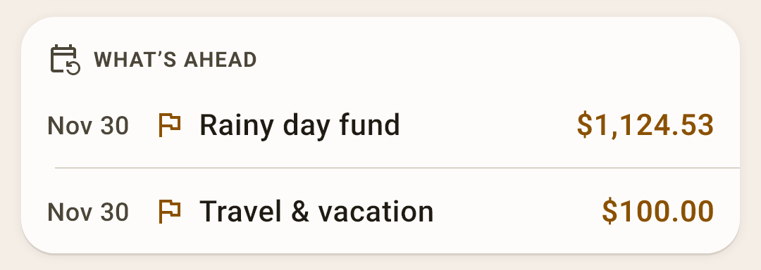
The nearest scheduled payments and goals that are short of money — up to six rows, by date.
How it works
A scheduled payment has a calendar icon, a goal has a flag. There are two goals in the screenshot: “Rainy day fund” is $1,124.53 short by the end of November, “Travel & vacation” — $100. The amount in yellow is how much more needs to go in.
The rows aren't tappable: to put money into a category — the “Budget” screen, scheduled payments — “Settings → Planning”.
 Open the screenshot full size ↗
Month budget
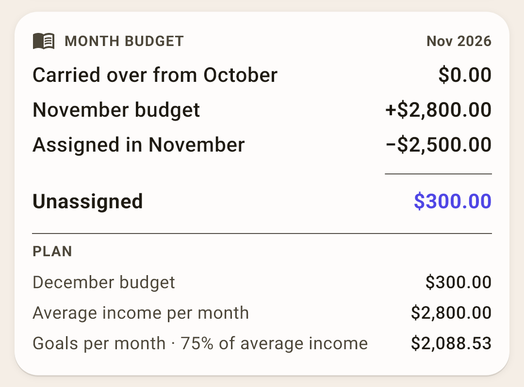
Where the “Unassigned” number came from: a ladder from last month's balance to the total.
How it works
Read it top to bottom, like a receipt:
Carried over from October — how much wasn't assigned last month.
November budget — this month's income: in the screenshot, two paychecks of $1,400 each.
Assigned in November — how much has already been divided among envelopes.
Unassigned — the total, the same number as on the chip at the top of the screen.
Below the line is the “Plan”: how much is already there for December, the average income per month, and how much your goals ask for per month, with the percent of income. Sometimes more rows appear — last month's overspending, money from savings, money set aside ahead; the block hides empty rows.
The card can be swiped both ways, forward too: you can assign money for December already in November.
 Open the screenshot full size ↗
Net worth
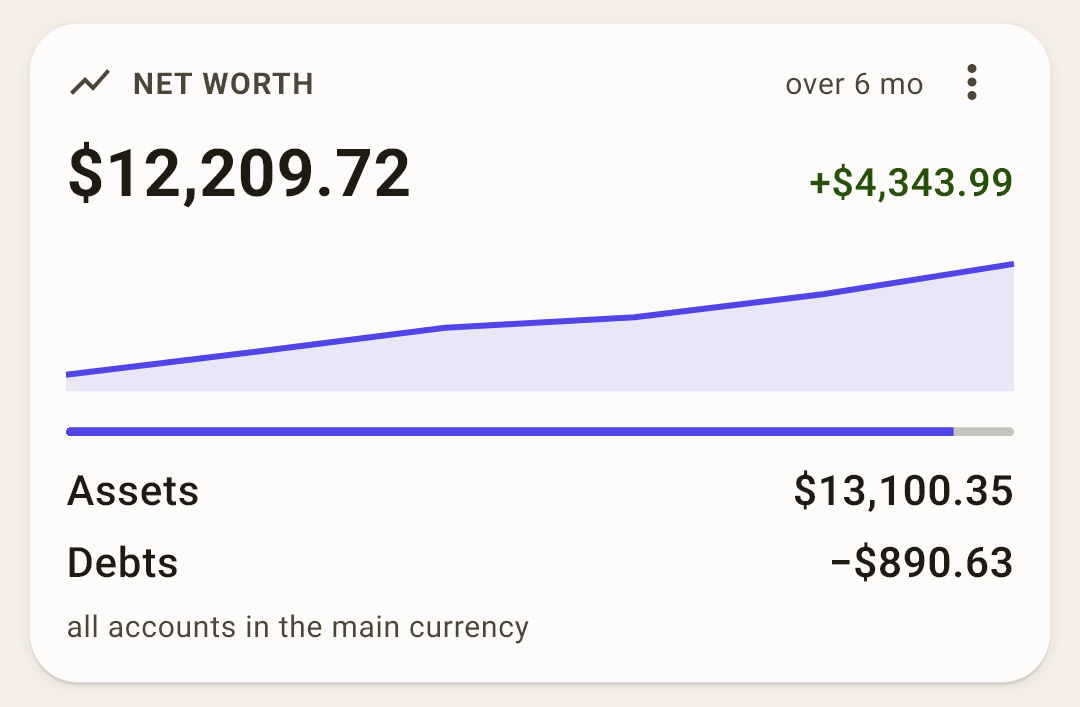
Everything you own minus debts — and how it changed.
How it works
In large type — your net worth today: $12,209.72 in the screenshot. On the right — how much it grew over the period (+$4,343.99 over 6 months), below — a line by month and a breakdown: “Assets” (all accounts with a plus) and “Debts” (credit cards and loans).
In the block's “⋮”: the period — 6 months, 12 months, this year or all time — and “Accounts in other currencies”: such accounts appear as separate rows in their own currency, without conversion and outside the overall total.
Right after installing: the block is off; turn it on in “⋮” → “Widgets”.
 Open the screenshot full size ↗
Goals
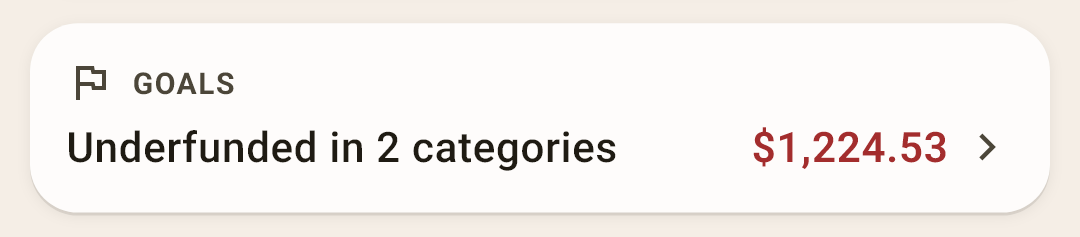
How many categories fall short of their goal this month, and by how much. Tap it to open the “Goals” screen.
How it works
In the screenshot, two goals are short by $1,224.53 together. Goals are set on the category screen or on the “Goals” screen: “Set aside every month”, “Save up by …”, “Keep on the balance”, “Percent of income” or “list”.
 Open the screenshot full size ↗
Pay yourself
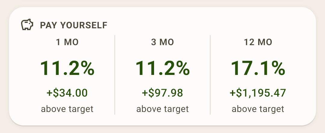
What percent of your income you set aside for your future self — over a month, three months and a year.
How it works
The rule is old and simple: from every paycheck, first pay yourself, and only then everyone else. The norm is 10% of income.
In the screenshot, 11.2% is set aside in November — $34.00 above the norm. If it's below the norm, the percent has “short” under it, with an amount.
Which categories count as “saved” is your choice: “Settings → Budget → Pay yourself”. Usually it's savings: “Rainy day fund”, “Investments”. With none selected, there's no block.
 Open the screenshot full size ↗
Big expenses
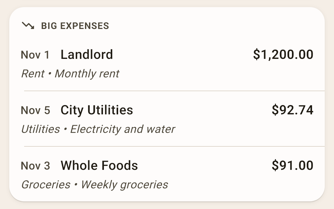
The month's three biggest expenses — date, payee, amount, category and note.
How it works
It helps catch what stands out: an unexpectedly expensive shopping trip is visible right away, not at the end of the month.
Right after installing: the block is off; turn it on in “⋮” → “Widgets”.
 Open the screenshot full size ↗
Calendar
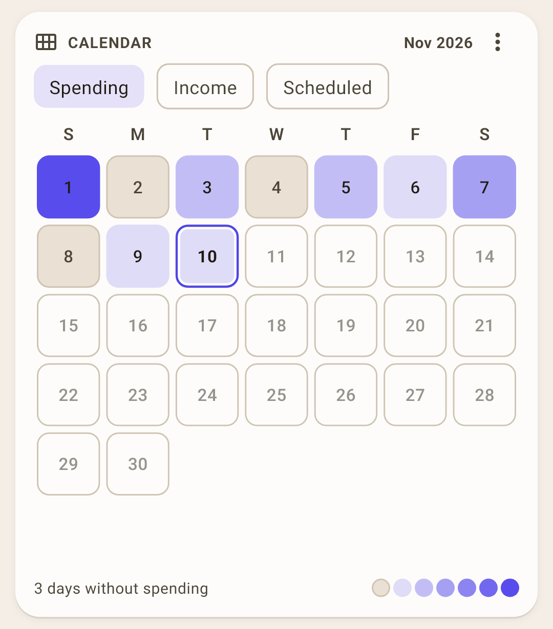
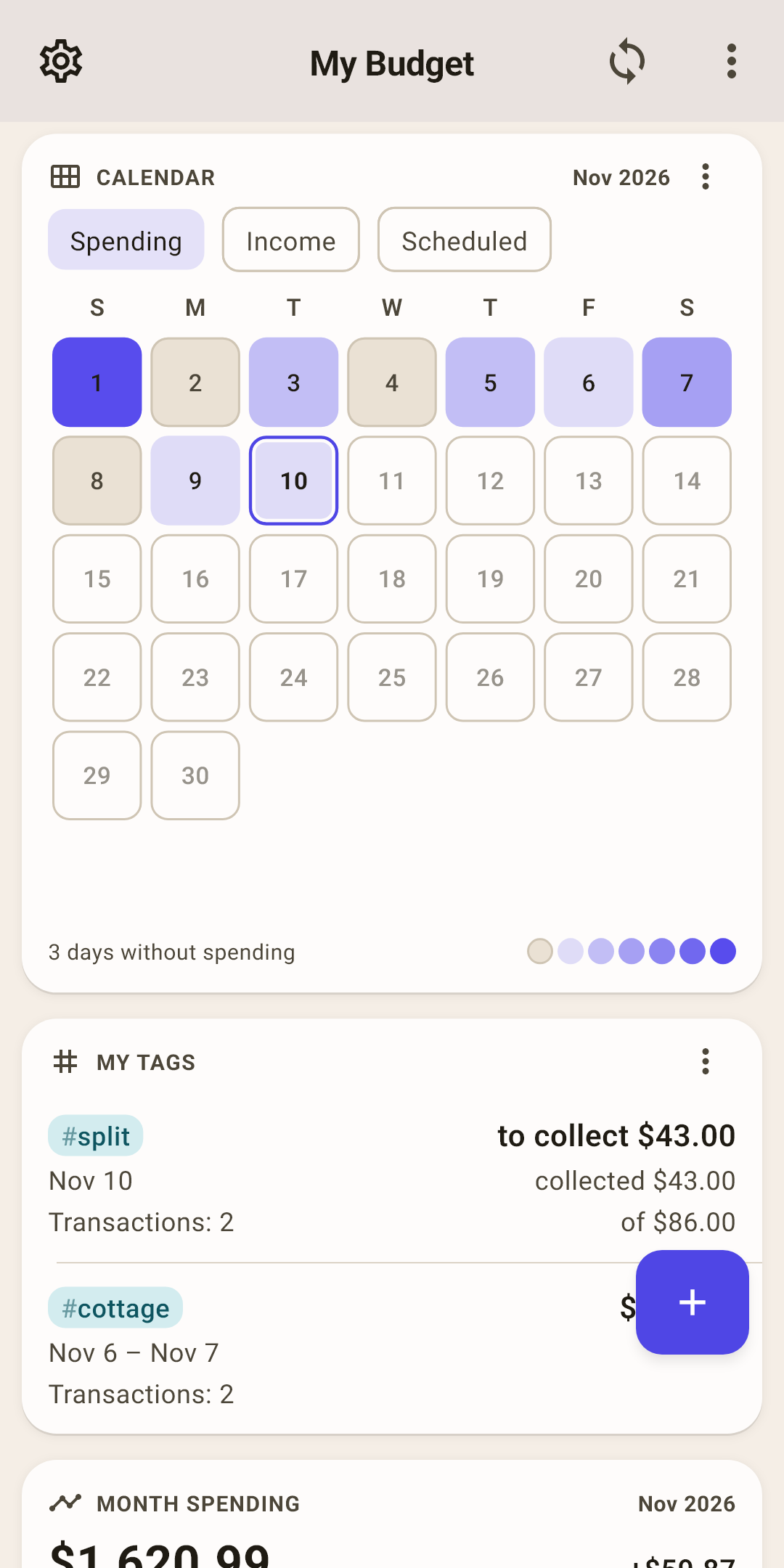
The month as a grid of days: the brighter the cell, the more was spent. Tap a day to see what happened on it.
How it works
A detailed look with the modes and menu — below.
 Open the screenshot full size ↗
My tags
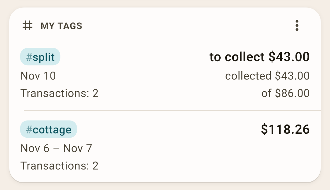
Up to four tags: how much was spent under them, over what span, and how many transactions.
How it works
A tag with “Settle up” shows on the right how much to collect or to return to break even: in the screenshot, “#split” shows “to collect $43.00”: a purchase at “Target” was split with a friend, and he has already paid back half. Tap a tag to open its screen. “All tags ›” at the bottom of the block — the whole list.
In the block's “⋮”: “Choose tags…” — which four to show and in what order; and the period — “Total for the whole tag” or “Total for this month”. Choose nothing, and the app shows tags with transactions in the last 30 days by itself. No tags — no block.
About tags themselves — in the article “Activity”.
 Open the screenshot full size ↗
Month spending
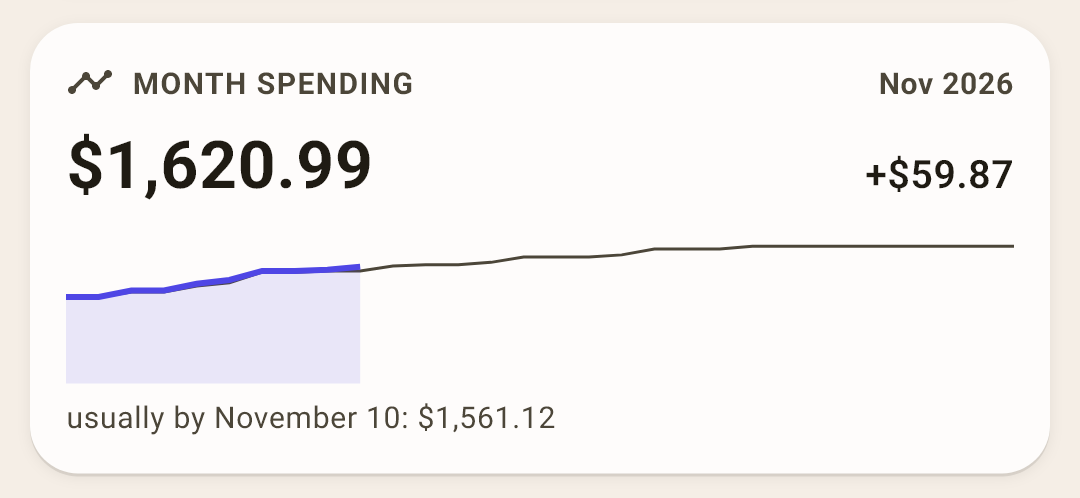
How much you've spent since the start of the month — against how much you usually spend by this date.
How it works
In large type — spending since the 1st: $1,620.99. On the right — the difference from usual: +$59.87, that is, slightly more than usual. The bright line is this month, the thin one is the usual.
“Usually” is the middle of your past months over the last year: one unusually expensive month won't shift it. The card can be swiped like “Where the money went”.
The calendar in detail
The liveliest block on “Overview”: a whole month on one card. Run your eyes over it — and you see which days were expensive and which passed with no spending at all.
Modes
What to color: “Spending”, “Income” or “Scheduled”.
How it works
“Spending” — six shades. The brightest cell is the month's most expensive day, and each step down is half as much. Brightness answers “how many times cheaper was this day than the most expensive one”.
“Income” — the same for incoming money, in green.
“Scheduled” — the days scheduled payments are due. A past day where everything was entered gets a check mark; where a payment was missed, the day number is red.
In “Spending” mode, a future day with a scheduled payment is outlined with a dashed line.
The calendar menu
Three dots in the card's header, to the right of the month. It sets what else to draw on the grid and what to show in the day sheet.
How it works
The day sheet isn't a menu item. It opens when you tap a number in the calendar grid: a list of what happened that day slides up from the bottom (screenshot below). The menu only sets up what that sheet contains.
Items in “Spending” mode:
“Income as dots” — a day when money came in gets a green dot in its cell.
“Whole day in the day sheet” — tap a number, and the day sheet shows not only spending but also that day's income: as a collapsed row at the bottom; tap it to expand. Off — the sheet shows only spending.
In “Scheduled” mode the items are different: show future payments as a cell fill or a dot, and whether to highlight in red the number of a day with a missed payment.
Right after installing, “Income as dots” and “Whole day in the day sheet” are off.
Today
Today is outlined.
How it works
Swipe the calendar with your finger to see another month, back and forward with no limit: it doubles as a regular calendar where you can see which weekday a date falls on. To get back — the “Today” chip in the card's header.
Days without spending
How many days of the month passed without a single expense. On the right — the brightness scale.
How it works
An empty cell in the past is a day without spending. If the only thing that day was a refund from a store, there's an empty ring instead of a fill.
The day sheet: tap a number in the calendar
A sheet slides up from the bottom: the date and the day's total in the header, and below it each transaction. A split amount is shown in parts: in the screenshot, “Target” — $61 for groceries and $25 for cleaning supplies.
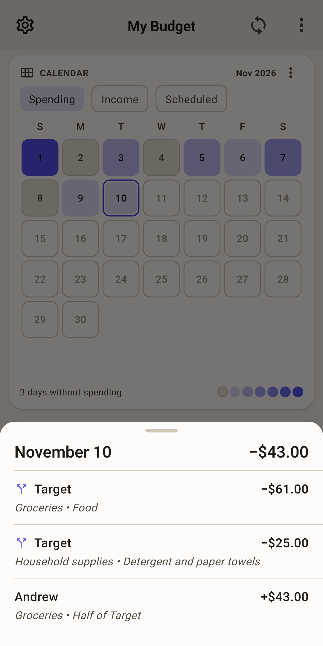
How to open it: on “Overview”, find the “Calendar” and tap the number of the day you want — in the screenshot above that's the 10th, outlined as “today” (G). The sheet shows what the calendar colors: in “Spending” mode — the day's spending, in “Income” — incoming money. To see both at once, turn on “Whole day in the day sheet” in the calendar menu (F). To close the sheet, swipe it down or tap outside it.
In “Scheduled” mode the sheet is different: what isn't entered, what is, and what's still ahead. Swipe a due date left — “Enter”, right — “Delete”.
Age of money in detail
The number on the chip answers the question: how many days did my money sit before I spent it. Your paycheck came on October 1, and on November 5 you buy bread with what's left of October's money — that money is 35 days old. The app takes the last ten expenses, finds for each which income paid for it (the oldest money first), and shows the average.
Under 30 days
Paycheck to paycheck: today's spending is paid from the latest paycheck, and any delay hits right away.
30 or more
A month ahead: you spend last month's money. That's the method's goal — what to do next.
A minus
More was spent than there was in the budget accounts.
Three ways to calculate
Age of money is a debatable metric, and there's no single correct formula for it. So the way is up to you: “Settings → Budget → Age of money”. The number changes right away — both on the chip and in the “Age of money” report.
Classic (YNAB FIFO) · right after installing
The YNAB way. It doesn't see transfers at all — neither to savings nor from them. Spending you had no money for weighs exactly −1 day, whether it's a hundred dollars or ten thousand.
Good if you don't touch your savings: then it's honest and matches YNAB. Bad if you live on transfers from savings: money arrives in checking, it doesn't see it, and it draws cheerful positive days. On a real budget, the accounts were $3,000 in the minus, covered by transfers from “Investments” — and Classic showed +10 days.
Savings-aware · closest to the truth
A transfer from savings is money entering the budget, a transfer to savings is money leaving it. Spending beyond what you had is measured in days of your income: spent a week's income beyond what you had — about minus 7 days.
The result is the average over the last 10 expenses, so one expense in the minus among covered ones is softened.
Savings-aware, with debt depth
The same as the previous one while the budget is in the plus. But while it's in the minus, it shows not the average but the depth of the hole: how many days of your usual income it will take to close it.
That's no longer an age but an alarm signal. Handy while you're climbing out of the minus: the number honestly shrinks with every paycheck.
Which to choose
Closest to the truth is “Savings-aware”: it counts exactly the money in your budget accounts, with everything that came from savings and went to them. Classic is honest only while you don't touch savings. Debt depth is for those who are in the minus right now and want to see how much is left. If you don't move money to savings and back and don't spend more than you have, all three show the same number.
Age of 30 days or more: live on last month's money
Since your spending is already paid for by the last paycheck, this month doesn't need the current one. Give it straight to the next month: then every month starts with money ready, and you assign it in advance instead of waiting for payday.
How to do it
Record the paycheck as usual: “+ Transaction” → “Incoming”, payee, amount.
Tap the “Category” field. The “Where to put the income” sheet opens.
Choose “Income for December” — next month — instead of “Income for November”. Save.
The transaction date stays the real one — the day the money arrived. Only the budget month it shows up in changes. A paycheck you've already recorded is moved the same way: open it and change the category.
Which paycheck to start with
The one you haven't divided among envelopes yet. Moving it reduces this month's “unassigned” by the paycheck amount. If after that it shows a red “Over-assigned”, that money is already working this month: return the paycheck to this month and move the next one.
How the budget changes
This month lives on what came in before. The new paycheck no longer lands in its “unassigned”.
Next month gets its money in advance. On the “Budget” screen, flip forward with the “›” arrow — the paycheck is already in its “unassigned”, and you can fill the envelopes before the 1st. On “Overview”, in “Month budget” below the line — the “December budget” row.
On the 1st the whole month is already paid for. Money is assigned once, at the start of the month, rather than in bits after every payment. “Assigned last month” in auto-assign does it in one tap.
“% income” goals based on the month's income are known from the first day: the month's income arrived last month.
Reports (“Income and expenses”, “Pay yourself”) count such a paycheck in the month it's set aside for.
The age of money itself doesn't grow from this mark: it grows when you spend less than you earn. The mark locks in the reserve — next month's money won't dissolve into this one. Until its month comes, such income doesn't count toward the age.
The “⋮” menu
Budgets, how “Overview” looks, and display mode.
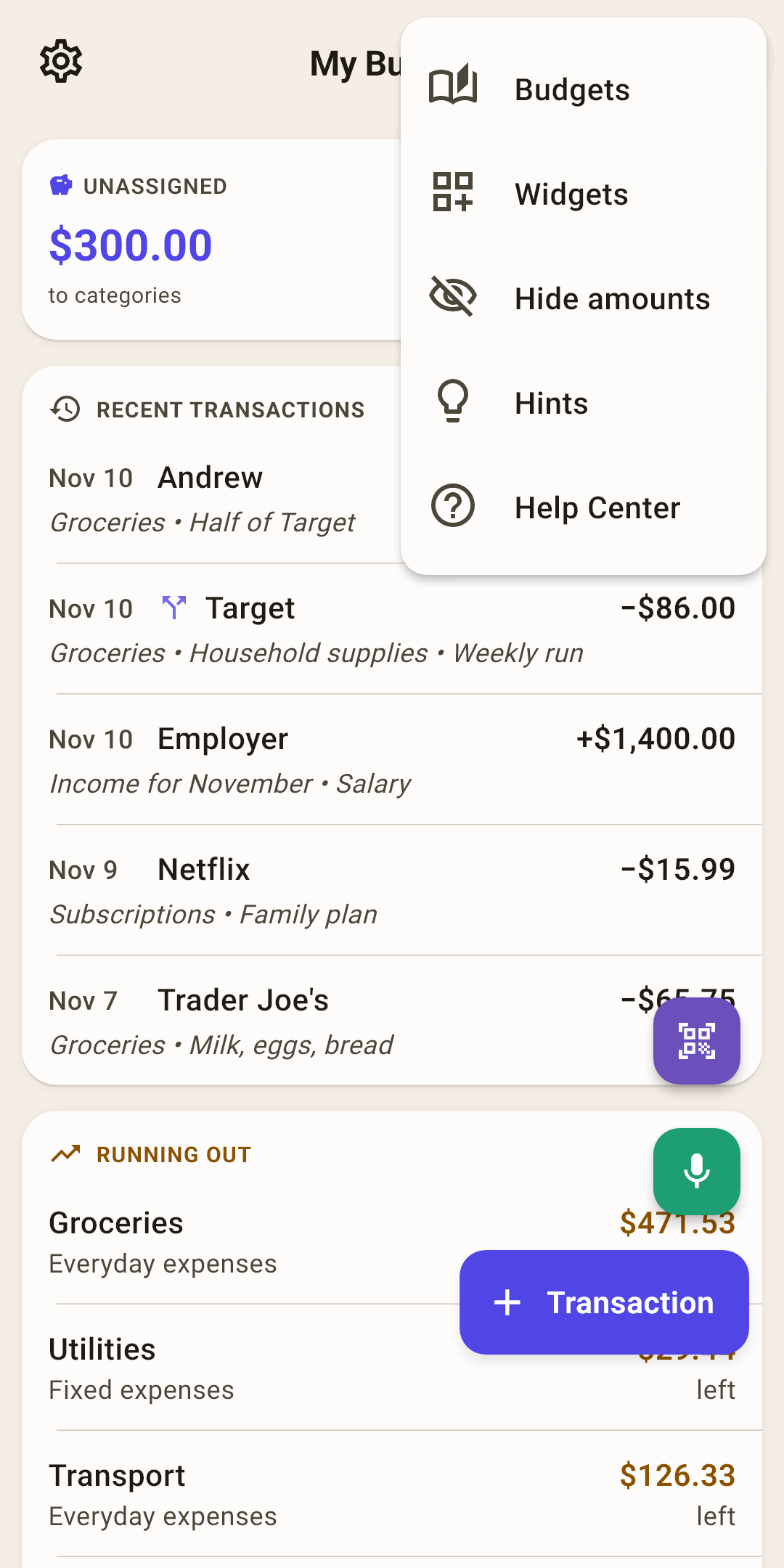
Budgets
Everything about budgets on one sheet.
How it works
“Create a new budget”, “Select a budget”, “Delete the budget”. The last remaining budget can't be deleted — the app needs at least one. To simply switch to another budget, it's faster to tap the name at the top of the screen.
Widgets
Which blocks to show on “Overview” and in what order.
How it works
A check mark — the block is shown, empty — hidden. To move a block higher or lower, drag it by the handle on the right. The setting lives on this device: on a tablet, “Overview” can look different than on the phone.
Hide amounts
Dots instead of numbers. For the moment when someone else can see the screen.
How it works
Turned the phone toward someone, taking a screenshot for support, recording a video — turn it on, and amounts on all screens become “••••”. The “+” or “−” sign stays: it says which way the money went, but not how much. Bars, charts and colors stay as they were.
While the mode is on, there's a crossed-out eye in the “Overview” header — tap it to bring the amounts back. Or in the same “⋮” — the item is now called “Show amounts”. The mode survives an app restart.
Hints
All of this screen's hints in one place.
Help Center
This article on the website: it opens in your browser, in the app's language.
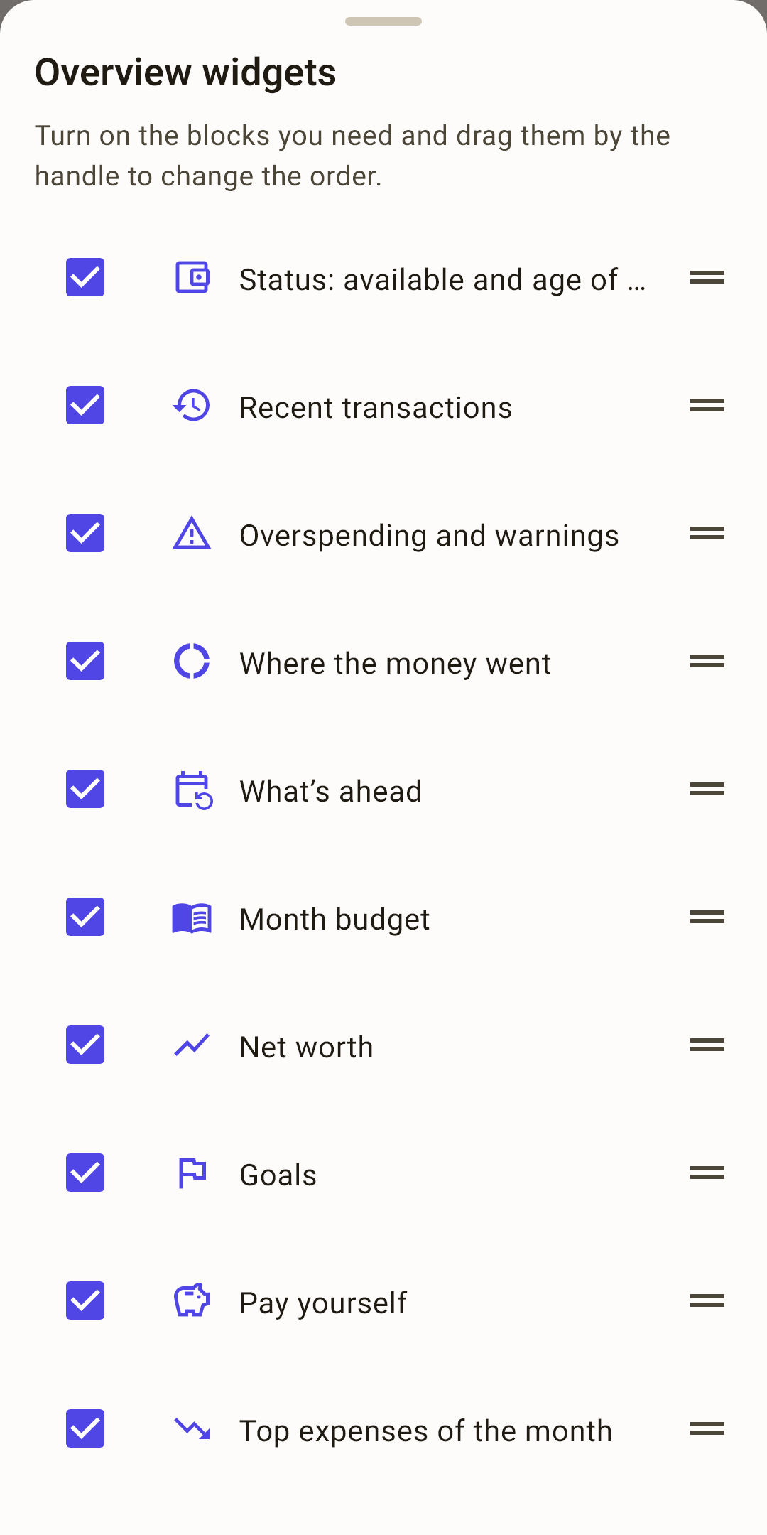 Open the screenshot full size ↗
What you can do on the screen
Most rows on “Overview” are read-only. The ones that can be tapped are those that lead somewhere.
| Do this | What happens |
|---|---|
| Pull the screen down | Recalculate all blocks. |
| Tap the budget name | Switch to another budget. |
| Tap “Unassigned” | The “Auto-assign the budget” sheet — if there's something to hand out. |
| Swipe a card left or right | Another month — for “Where the money went”, “Month budget”, “Calendar” and “Month spending”. On first launch, a finger shows you this gesture by itself. |
| Tap an overspending row | The category screen: balance, spending, the month's transactions. |
| Tap a calendar day | The day sheet: what happened that day. |
| Tap “Goals” or a tag | The “Goals” screen or the tag screen. |