
The sections are ordered by how often you need them: the most frequent at the top.
Planning
Everything that repeats: regular payments and reminders.
 Open the screenshot full size ↗
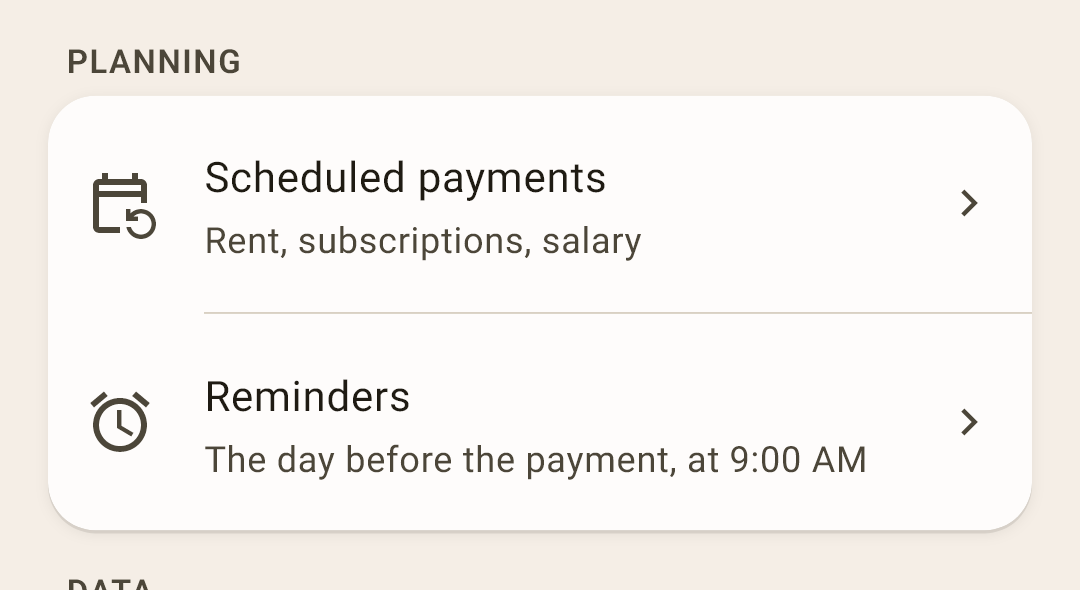
Scheduled payments — rent, subscriptions, a paycheck — everything that repeats. On the day, the app offers to enter the payment with one tap, and “What’s ahead” on “Overview” shows the upcoming ones.
Reminders — when and about what the app notifies you. A screen of its own — below.
The “Reminders” screen
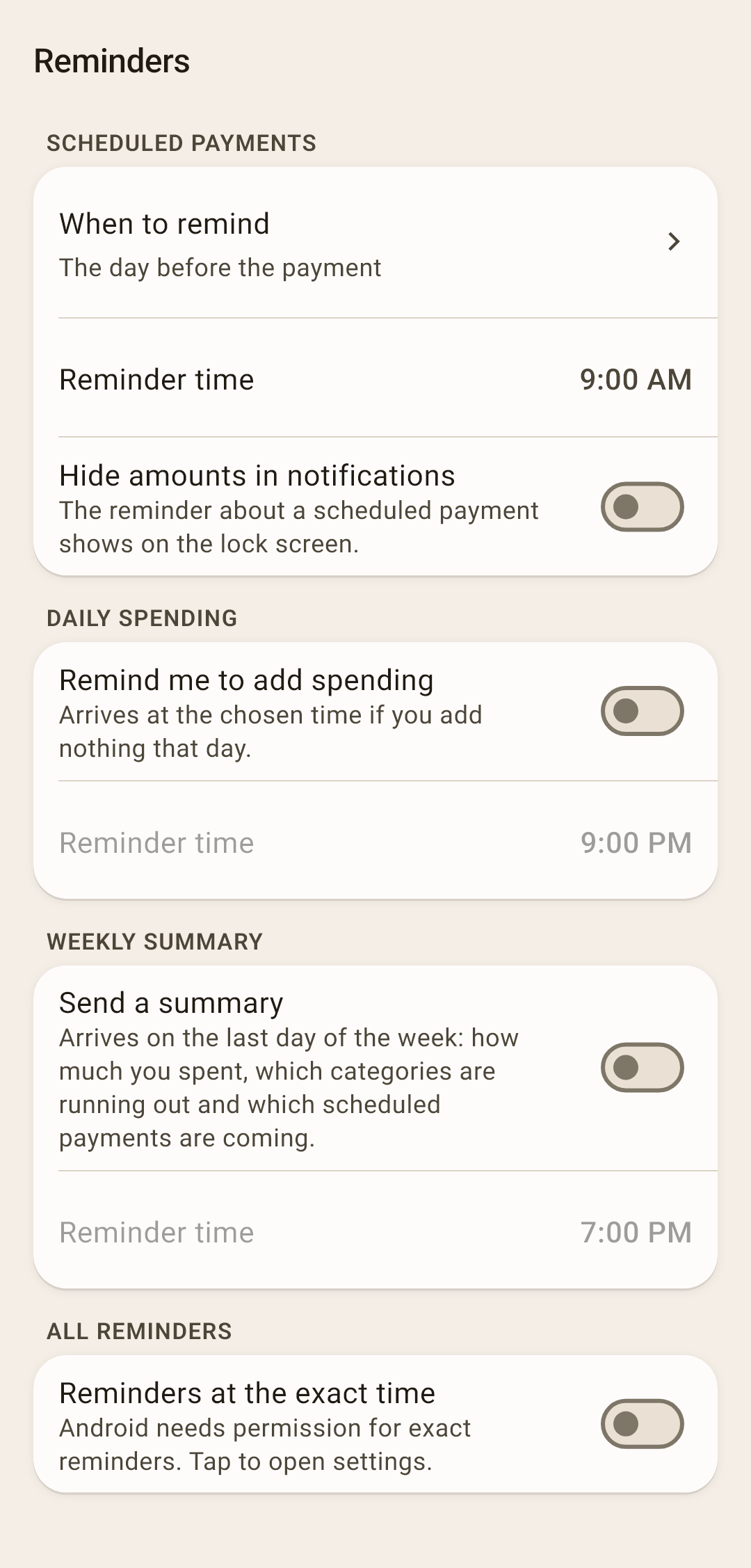
Scheduled payments — “When to remind” — on the day of the payment, 1, 2 or 3 days ahead, or a week ahead; “Reminder time”; “Hide amounts in notifications” — the reminder shows on the lock screen, and without this anyone who picks up the phone can read the amount. Right after installing: the day before, at 9:00 AM, amounts visible.
Daily spending — “Remind me to add spending” — in the evening, if you haven't recorded anything today. If you have, it stays quiet. Right after installing: off, at 9:00 PM.
Weekly summary — “Send a summary” — on the last day of the week: how much was spent and on what the most, which categories are running out, which scheduled payments are coming. Right after installing: off.
All reminders — “Reminders at the exact time”. Without permission, Android is allowed to deliver a reminder late. The switch opens the Android settings where that permission is granted.
Data
The budget's lists and exchanging data with other programs.
 Open the screenshot full size ↗
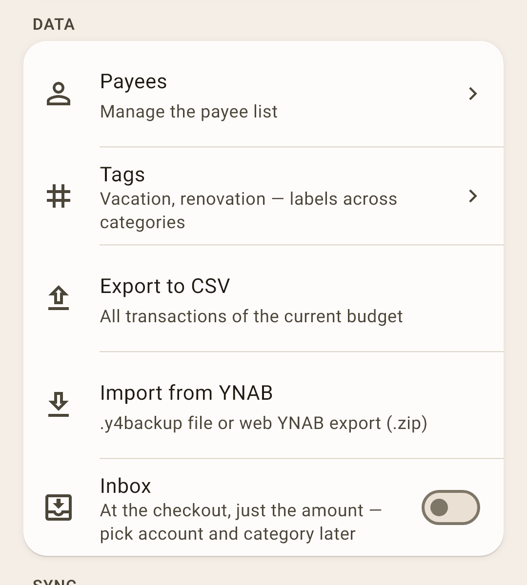
Payees and Tags — lists that build up by themselves as you record transactions. All about them — in the article “Payees and tags”.
Export to CSV — all of the current budget's transactions as a spreadsheet file — to open in Excel or Google Sheets.
More
The file has everything a transaction has: date, account, payee, category and its group, amount and currency, “cleared”, note, the parts of a split amount, transfer, tags, flag, e-receipts, the budget month (for a paycheck recorded “for next month” — the month it's set aside for), and for a transfer between currencies — how much arrived, in what currency and at what rate. Only photos and PDFs aren't exported: they're files on the phone.
Column names are in English (date, amount, tags…) and don't depend on the app's language: that way formulas and pivot tables don't break if you change the language. Numbers in the file are always real, even if “Hide amounts” is on. The field separator follows the number format, so the table opens as columns rather than one line.
Import from YNAB — move a budget from YNAB 4 (a .y4backup file) or from web YNAB (a .zip export): accounts, categories and the whole history. After the import, a glossary shows what each YNAB term is called here.
Inbox — at the checkout, just the amount; you choose the account and category later. How it works — in the article “Transaction form”. Right after installing: off.
Sync
The cloud, backups and moving a budget between devices. Here briefly what's where; in detail — the article “Cloud and backups”.
 Open the screenshot full size ↗
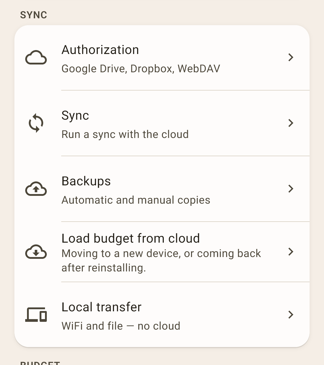
Authorization — connect a cloud: Google Drive, Dropbox or WebDAV. The main rule: all devices that keep this budget use the same cloud account, otherwise they won't see each other.
More
If family members have different Google accounts, create a separate, new Google account for the budget and sign in to the app's cloud only with it, on all devices. Don't sign in to your personal account on your wife's phone, or to hers on yours: the phone will start syncing contacts, messages and photos with that account, and two people's personal data will get mixed up. A separate budget account knows only about the budget.
Dropbox — sign in with your Dropbox username and password, not with the “Continue with Google” button. Signing in with Google ties Dropbox to the Google account you used — and on a device with a different Google account it's easy to end up in a different Dropbox that doesn't have your budget. A Dropbox username and password work the same on any device.
WebDAV — a cloud that supports it (Nextcloud, ownCloud, pCloud and others) or your own server; the same address, username and folder on all devices.
Sync — exchanging edits with the cloud and other devices; also the password that encrypts the cloud, and the sync log.
Backups — copies of the budget: automatic on a schedule and manual, on the phone and in the cloud. Also from here — a “Readable copy” as a file.
Load budget from cloud — a new phone or a reinstall — the budget comes back from the cloud or from a backup file.
Local transfer — move a budget between your own devices over WiFi or as a file — without a cloud.
Budget
Settings for the current budget.
 Open the screenshot full size ↗
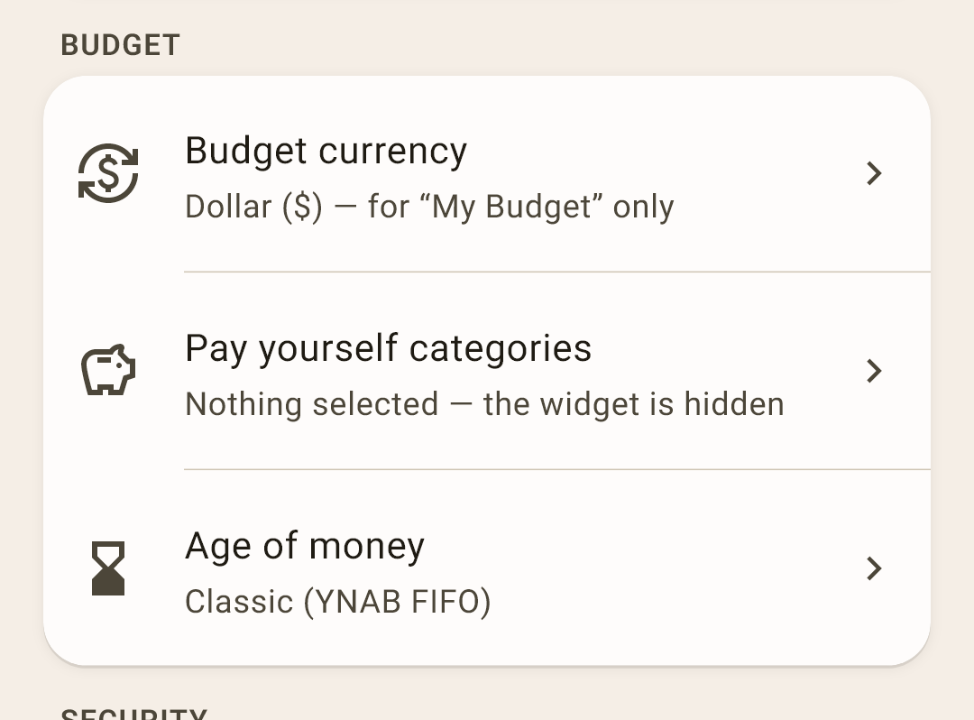
Budget currency — the symbol you keep your budget in. Only for this budget; the app doesn't convert amounts — only the symbol changes.
“Pay yourself” categories — which categories count as “set aside for yourself” — usually savings. With none selected, there's no “Pay yourself” block on “Overview”. What it shows — in the article “Overview”.
Age of money — how to calculate it: three ways. A screen of its own — below.
The “Age of money” screen
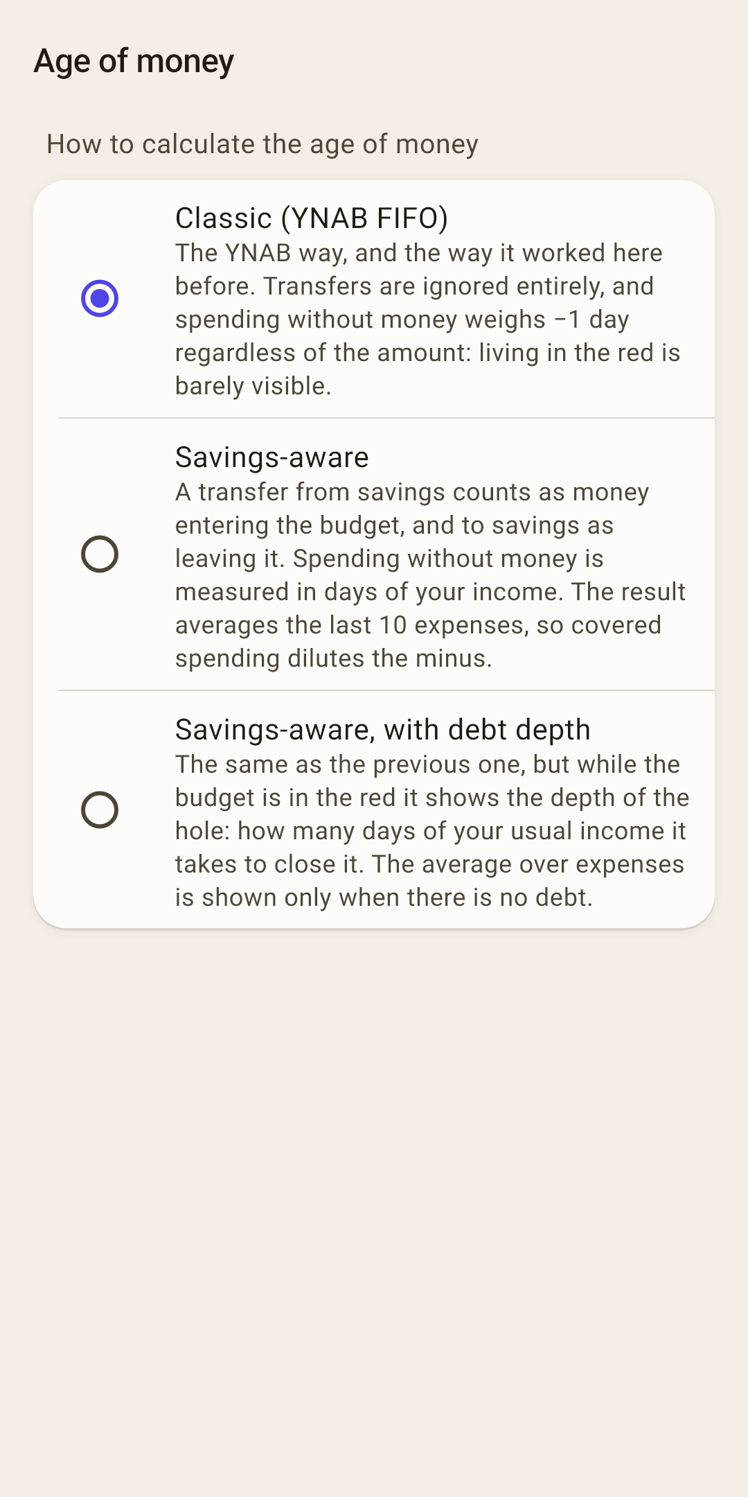
The three ways are described right on the screen. Which is closer to the truth and why, with examples — in the article “Overview”, section “Age of money in detail”. In short: “Savings-aware” counts exactly the money that's in your accounts. Right after installing: “Classic (YNAB FIFO)”.
Security
A lock on the app.
 Open the screenshot full size ↗
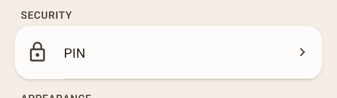
PIN — the app asks for it when opening. Once a PIN is set, “Biometric unlock” appears below — a fingerprint or face instead of digits.
More
Without a PIN, biometrics can't be turned on: there's no lock without it. While a PIN is set, the app's card in the list of open apps is covered, and prying eyes won't see your balances there (on Android 13 and newer).
Appearance
Two screens: language with formats, and the whole look of the app.
 Open the screenshot full size ↗
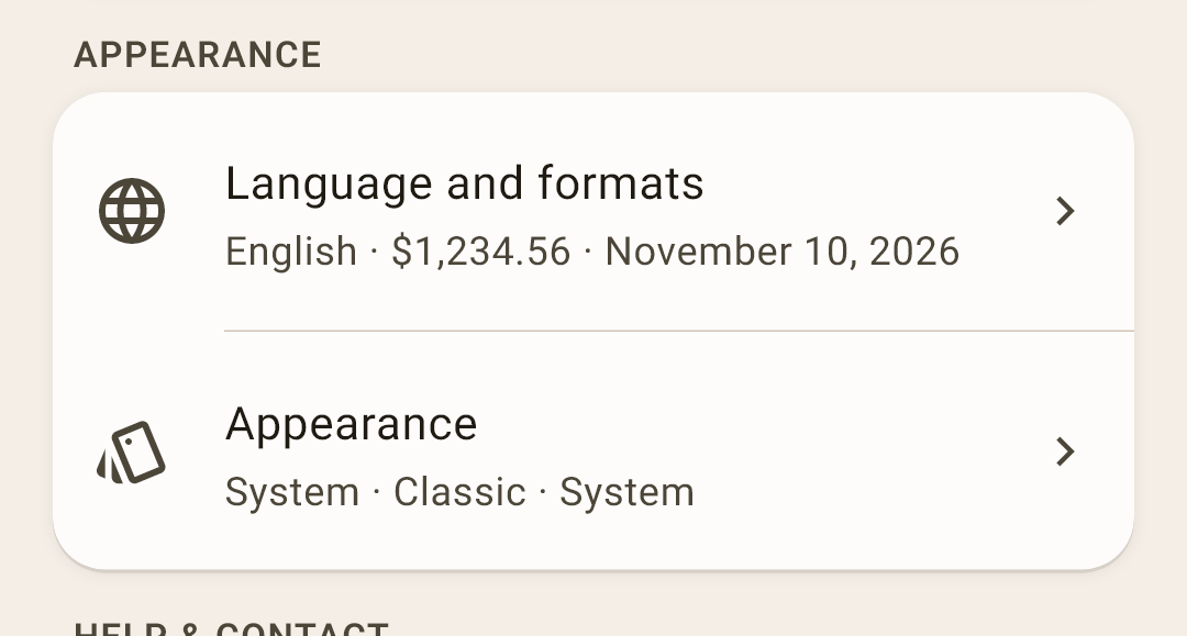
Language and formats — the interface language, how amounts and dates look, how to type an amount. The screen — below.
Appearance — theme, style, font, icons and how a transaction row looks. The screen — below.
The “Language and formats” screen
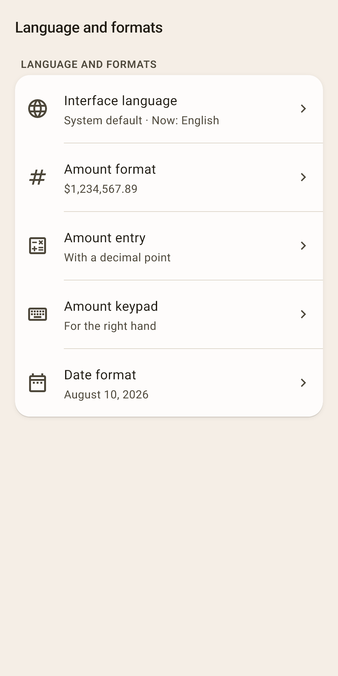
Interface language — thirteen languages; “System default” is the phone's language. The language lives on this device and doesn't sync: the phone can be in English and the computer in German.
Amount format — thousands and decimal separators, which side the currency symbol goes on. By default — as is usual for the chosen language: “$1,234,567.89”.
Amount entry — “With a decimal point” or “From cents, like a card terminal” (1-2-5-0 means 12.50). Right after installing: with a decimal point.
Amount keypad — “For the right hand” — digits on the right, operators on the left; “For the left hand” — the other way round. Right after installing: for the right hand.
Date format — order, separator, month as a number or a word — 24 options to choose from.
The “Appearance” screen
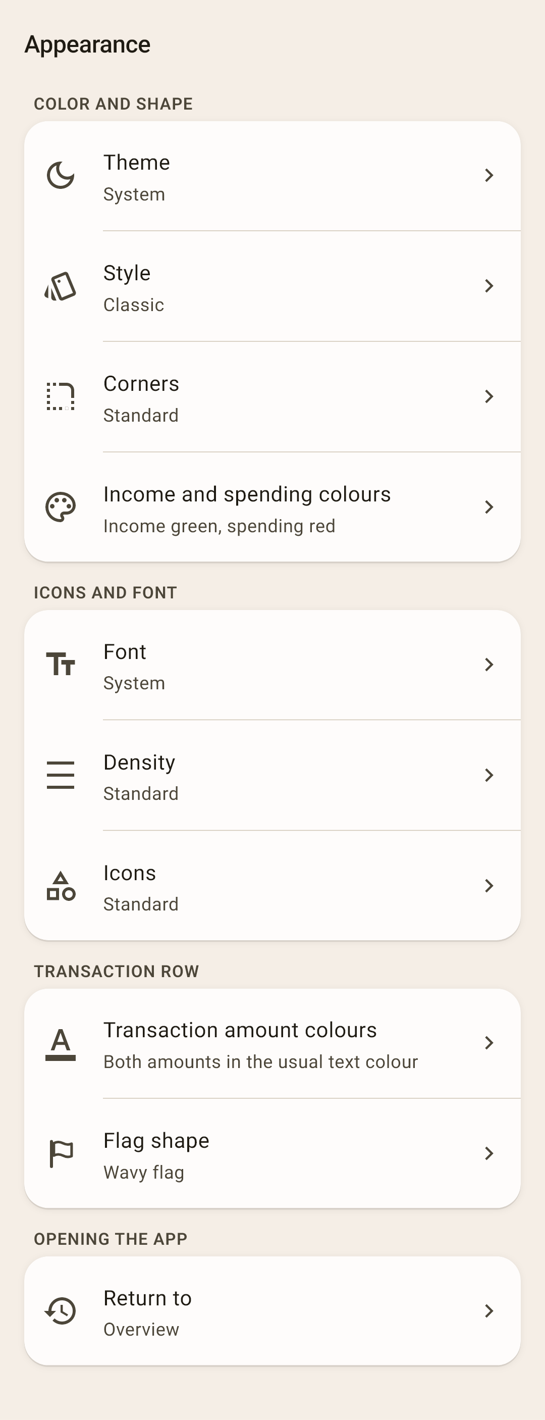
Theme — “System”, “Light” or “Dark”. “System” follows the phone.
Style — the app's color character: “Classic”, “Neon”, “Aurora”, “Acid”, “Candy”, “Marshmallow”, “Graphite”. Each has a light and a dark version.
Corners — “Sharp”, “Standard” or “Soft” — the corners of cards, buttons and chips. Independent of the style.
Income and spending colours — “Standard” — income in green, spending in red. “Reinforced” — income in blue: for those who find it hard to tell green from red.
More
About one man in twelve and one woman in two hundred see colors differently. There are three kinds:
deuteranopia — weaker perception of green; the most common;
protanopia — weaker perception of red;
tritanopia — blue and yellow get confused; very rare.
With the first two, green and red merge into a similar brownish color, and income can't be told from spending by color. Both of these see blue well — that's why in “Reinforced” income is blue.
What else the app does for these people — already, without any setting:
every amount has a “+” or “−” sign: the direction of a transaction is visible with no color at all (and right after installing, transaction amounts have no color anyway);
overspending speaks not only with color but with an icon too: a wallet — you spent your own money, a card — you went into credit card debt;
a sync that failed changes not only the icon's color but its drawing too — a “!” appears inside;
the colors of report charts are chosen so that neighboring slices differ in brightness too, not just in hue.
What “Reinforced” changes: income in blue everywhere — in amounts, in the income form's header, in the charts and in the “Income and expenses” table; transaction flag colors are spread apart by brightness; the report charts and “Money flow” use their own color set. Each set is checked against all three kinds during development.
“Reinforced” also helps those who tell colors apart well but look at the screen in bright sunlight.
Font — the system font or one of seven: “Fira Sans”, “Geologica”, “IBM Plex Sans”, “Inter”, “Manrope”, “Noto Sans”, “Source Sans 3” — for the whole interface.
Density — “Compact”, “Standard” or “Comfortable” — the space between rows and blocks. The size of the letters doesn't change.
Icons — “Standard” or “Two-tone”.
Transaction amount colours — whether to color amounts in transaction lists: “No colour”, “Income only” or “Spending and income”.
More
Right after installing — “No colour”, and every screenshot in this guide was taken that way. Why: red is the color of alarm, and buying bread doesn't deserve an alarm; when every row glows red, the color stops saying anything. The sign shows the direction of a transaction: “−” for spending, “+” for income. Want color? Choose “Spending and income” or “Income only”.
Category overspending, debt and sync state stay colored whatever you choose: there, color is a warning.
Flag shape — “Dot”, “Triangle flag” or “Wavy flag” — how the flag looks in transaction rows.
Return to — “Overview” — after a break of more than 30 seconds and at launch, “Overview” opens; “Where you left off” — the same screen, even with a form open. The PIN is asked in both cases.
Help & contact
Hints and getting in touch with the developer.
 Open the screenshot full size ↗
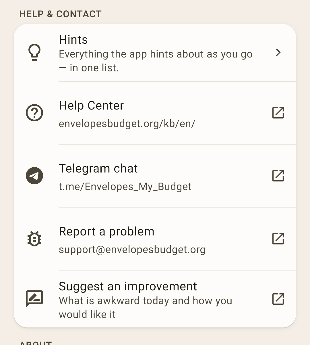
Hints — all of the app's hints as a list, by screen. Also “Show hints again”. One screen's hints are also opened by the “Hints” item in its “⋮” menu.
Help Center — articles about every screen on the website, in the app's language; this item opens the main page. One screen's article is opened by the “Help Center” item in its “⋮” menu.
Telegram chat — a group where questions get answered and where you can ask other users.
Report a problem — an email to the developer. The app and device versions are filled in by themselves; you can attach the event log from “About”.
Suggest an improvement — an email with an idea: what's awkward now and how you'd like it.
About
One row, and behind it a screen with the version, documents and service items.
 Open the screenshot full size ↗
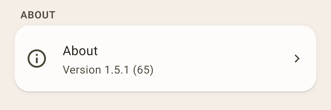
About — the screen — below.
The “About” screen
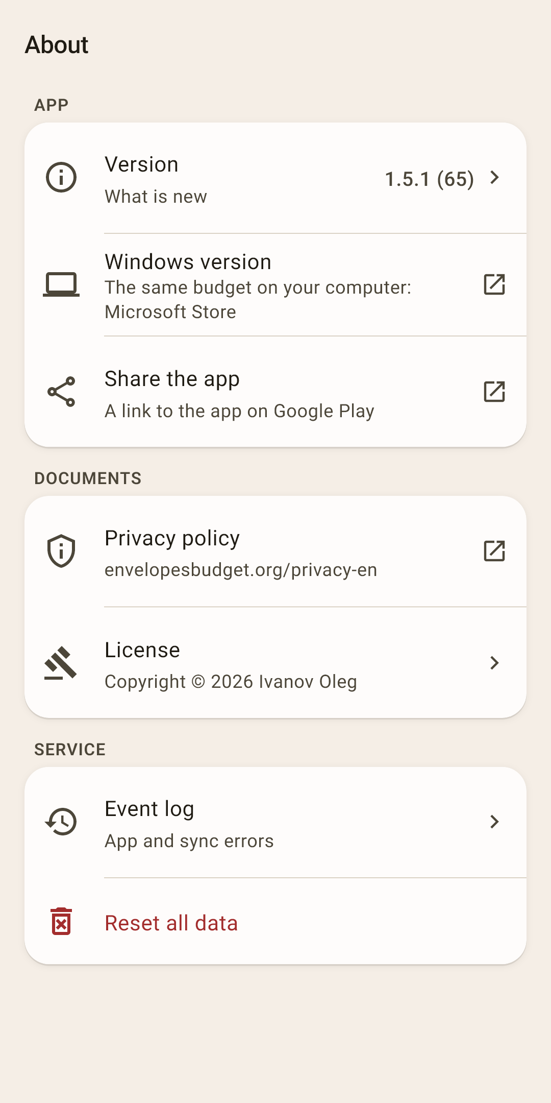
Version — the version number; tap it for “What is new”: what changed in the latest releases.
Windows version — the same budget on a computer — in the Microsoft Store.
Share the app — send a link to the app on Google Play.
Privacy policy and License — documents. In short: your data is yours, and the developer has no access to it.
Event log — app and sync errors. Useful if you're writing about a problem.
Reset all data — delete all accounts, categories, transactions, scheduled payments and goals. The app asks again: “Reset all data?”. This can't be undone.
More
If sync is connected, the data comes back from the cloud on the next sync. To delete it for good, disconnect the cloud or delete the sync file in it. Before resetting, make a copy in “Backups”.